Evaluate this classroom experience and your progress towards meeting these objectives. Consider your understanding and progress. How well do you think you are doing in this class? Taking into consideration the points obtained in the above grid, what grade do you think you deserve? Write about 300 words, and the last sentence must include a letter grade you feel you have earned.
Answer---
I have enjoyed my experience in this class this quarter. I found it really interesting to learn all the many different aspects of the advertisement world. I have found this class to be very interesting and I have learned many things that I will take with me the rest of my time at this school, and after I graduate. This class has been very helpful in many ways. I believe that doing the weekly blog posts will also help me because I can always go back and look at them if I ever need to. I have been slacking on my tweets in this class. I have not posted everyday but I have tried to catch up whenever I could therefore my tweets are a little behind but I have tried to keep up on them whenever I could. Besides the fact that my tweets are behind I believe that I am doing very well in this class. I understand everything that Mr Pinto has taught us and will use it in life after I graduate from this school. My classroom experience has been a good one. I have learned many different things in this class that I find very helpful. I am glad this class is offered at this school and I had the opportunity to take it. Based on the facts that I have been keeping up with my blogs, all including the correct amount of words, and I have been behind a little on my twitter account I think that the grade I deserve in this class would probably be a B. Maybe if I didn’t slack on my tweets I would deserve a better grade such as an A-. I think that my final grade should be a B-.
Thursday, September 23, 2010
Thursday, September 16, 2010
EOC week 10 Art serving capitalism
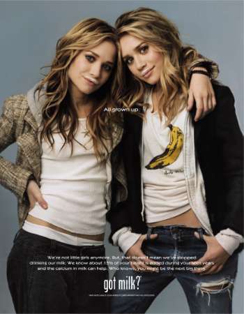
Art serving capitalism. These two working together to make great advertising campaigns. Advertisements would be very boring and bland without any artistic input. A great example if this is the simple milk moustache and its slogan “Got Milk?” which is widely known by many people. Before this milk was not really sometime you saw many ads for. Kurt Graetzer was the man who came up with this simply but artistic move. Many businesses gain much capitalism when they create an artistic advertisement for their ad campaigns. “If you ever wondered how Nike came up with, "Just Do It," the slogan that the film tells us inspired women to divorce their husbands, the answer is simple: on the brink of his execution, a man on death row in Utah said, "Let's do it," this was reported in the newspaper, and a Nike man saw it and changed it to the catch phrase that helped Michael Jordan make Nike $5.2 billion.” “[http://sb.city2.org/blogs/paulrivas/blog_entries/626-review-of-art-copy-at-sbiff-art-serving-capitalism/blog_comments/new] This is a great example of art serving capitalism. This is a quote talking about the Sundance film Art & Copy. By saying something so simple such as “just do it” Nike capitalized on over five billion dollars. This is similar to the Got Milk campaign and many others just like it.
Final Project 6: Analysis of Project in the Real World

my final product is this advertisment for Jones Soda Co. It displays four jones soda bottles in christmas colors with the logo and slogan beside it.
picture credit http://www.6degreeslorisuzanne.com/2008/10/neat-favor-idea.html
Final Project 5: Creative Content
Who will be involved in the promotion? The people involved in this promotion is the Jones Soda company. They will be behind this ad campaign 100%.
When will it happen? It will happen inside of many different magazines around the holidays. I have used a photo of red and green flavors to give it that Christmas spirit. I did not choose to use the holiday flavors because I did not want this ad to be too much in your face. I wanted it to be simple.
How often will you hold a promotional event? During each holiday I will hold a promotional event displaying holiday flavors including the wacky holiday dinner ones and the simple flavors that make anyone feel comfy during the seasons.
Final Project 4: Promotion

The promotion method I have chosen to use is print ad. I am using a print advertisement to draw in customers to purchase my product. It is a photograph of the product with the slogan and logo right beside it.
Final Project 3: The Big Idea

The concept for my advertisement is behind the slogan. A healthy pop for a creative mind. Being a healthier soda choice will intrigue many people to try out this product. Many people these days enjoy living a healthy lifestyle and wouldn’t mind drinking this guilt free soda. Others like to drink soda most of the time and the many creative wacky flavors Jones soda offers will most likely draw them in to their products. Jones Soda co. focuses on their customers first. They like to have their customers’ input and ideas going into every product that they sell. Every bottle they produce is labeled with a photograph taken by their customers. This is also likely to draw in customers to consume their products. My campaign will focus on these facts. A healthy pop is what many people are looking for whether they want to have a guilt free pop or just for the great taste. A creative mind, many artistic people would like to get their work out there whether they are inspiring photographers or just doing it for fun, having their picture on bottles around the world would make anyone want to get out there and take pictures for the chance to make that happen. I believe that this will set my product apart from its many competitors, that focus more on selling their product rather then focus on the people they are selling it to. My campaign will focus on these facts and hopefully based on this, many customers will be intrigued to buy this product.
Final Project 2: Competitive analyses
The more money that a company has the more they can get their name out there, the more customers they are bound to get. Jones soda is different. They have no advertisements. No commercials. No way of getting their name out there. This makes them the underdogs in the beverage industry. By doing this, it gives them more of an underground edge, which makes them more appealing to the teens who want to seem cool and different. Their top competitors are Coca Cola company, Dr Pepper Snapple group inc., and Hansen Natural Corporation. Coca Cola is one of the worlds largest soda companies. Many even say that it is the McDonalds of the beverage world. Closely followed behind them is Dr.Pepper co. and not too far behind them is Hansen Natural Co.
 How do they draw customers and clients? Coca Cola has been around for over 100 years. They draw in customers in many different ways. One of these ways is by making their commercials and advertisements look as though they were made in the 50s, 60s, and even the 70s. This attracts older generations that have been enjoying their product for years giving them a sense of being back to that time era. Another technique they use is by putting familiar characters on their cans, such as Santa Clause, attracting children to this product. Coca Cola as also teamed up with American Idol , thus giving them a wider audience to sell their product to. Dr.Pepper appeals to their customers in almost the same way. They too have been around for a while and like to make their customers feel as though they are right back to the day they had their first Dr. Pepper. Hansen on the other hand isn’t as widely known or been around quit as long. They like to appeal to their customers by selling an all natural product. This makes people feel less guilt when consuming their product. In many ways these are similar techniques to Jones Soda. Jones likes to make their customers feel cozy and at home. They sell a friendly packaged product. By placing customers own photos on the labels, which makes people intrigued by their product. This draws them in along with the many wacky flavors such as Fufu berry, and Berries and Cream, along with their popular holiday flavors such as Turkey and gravy on Thanksgiving and cranberry sauce on Christmas. Without having to do many advertisements, Jones manages to sell its product to millions of people just by the creative labels.
  How do they plan on improving? Coca Cola improves itself all the time. They are always changing the labels and coming up with new ideas. Dr. Pepper doesn’t really improve much at first. They have had the same recipe and label forever. By doing this though, they are being loyal to their long time customers who will probably share this with their kids and so on. Hansen is improving by adding new flavors to their drinks all the time. Jones on the other hand is constantly improving. Their labels are never the same. They have new flavors all the time and even find wacky new ones for each holiday but that is what sets them apart from other beverages out there.
Final Project 1: Jones Soda- A healthy pop for the creative mind.

Jones soda is unlike any other soda company out there. With their many different flavors, including their wacky holiday flavors, and their creative labeling they are one of the most different companies out there. Customers can take their own photographs and submit them to the company’s website where the photos could be chosen to be on the label of bottles everywhere. They do not have one main label, they choose from many different submitted photos every month. Another unique fact about Jones Soda co. is the fact that on every cap of their sodas, they have inspiring and sometimes wacky quotes and fortunes. These too are customer submitted. By doing this I find Jones to be very creative. They are unlike any other soda company by doing their own thing and having the customers very involved in what they are doing and there is nothing else out there quit like them. Jones also has many health facts about it. They have many sugar free drinks, smoothies, and calorie free drinks. They also use pure sugar cane in their beverages, and real fruits. This makes them seem like a healthier choice compared to many of the other competitors out there. “”A benefit is the specific gain or advantage your ad is claiming” [pg 58;advertisning by design” This is true when it comes to Jones Soda co. By not advertising nearly as much as their competitors, and focusing on young teens, mostly in the skateboarding community, they try to make their customers believe that consuming this beverage. This is why i have come up with the slogan "
a healthy pop for a creative mind" The word pop symbolizes a synonym for the word soda and also could be used as a booster word.
Thursday, September 9, 2010
EOC Week 9 Triplets
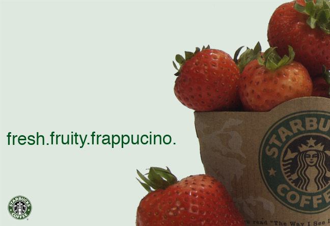 This advertisement campaign is for Starbucks coffee frappucinos. The four ads feature Starbucks hot coffee sleeves around fresh fruits stating that they are using fresh fruits in all of their drinks and that drinking this product will make you feel as though you are indulging in nothing less then a cup of fruits.
 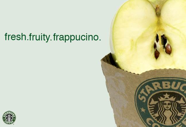 There are only three words in this ads and those are “Fresh. Fruity. Frappucino.” Stating that the refreshments they are selling are nothing less then that. They also want to let you know they make each of their products with real fruit and do not use any artificial chemicals when making their product
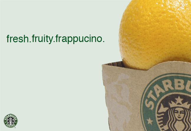 The first ad is for a strawberry drink, the second a green apple, the next a lemon and last blueberries. They are all similar in the fact that they are the same picture besides the fact that the fruits are different in each photo
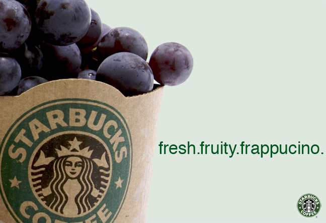 . By doing this, Starbucks is using the triples technique for their ad campaign, which we have learned about in class today as any advertisement that uses the same format in two or more of their advertisements.
Thursday, September 2, 2010
eoc week 8 really good example of chapter
“Using pictographic images in place of letters can be proactive” Says Michael Sickinger, Firmenich, New Jersey, which is very true when it comes to this advertisement. The ad is for the show Phantom of the Opera at the Venetian hotel in Las Vegas. The letter O in the word Phantom is a graphic image of the mask that the phantom wears during the show making the title PHANTOM pop out at you even more. This is a very creative idea that they are using. The ad shows the famous Phantom of the opera about to kiss the leading lady with a chandelier behind them looking as though it is falling from the sky which may represent chaos. “Be size appropriate. Small type on a billboard may does not work. Put your work in context” Carlos Segura, Segura inc., Chicago says. This applies very much to this advertisement. The biggest word on this advertisement is the title of the show “Phantom” which makes us know that is the most important word. Phantom is what the show is about and what people will go to see. The second biggest font is the word “You’ve never seen it like this” which tells us that they want us to go see the show in hopes that it will be better then any other Phantom of the Opera shows. That there is sometime different about this one. This may draw people in more. All the small less important details are written in smaller font. For instance where its located at. Drawing someone in to what you are selling is more important because once they are drawn then they look for where its at and where they can get information from. “Try this when experimenting with a font: All lowercase all uppercase and bother upper and lowercase” Says Deborah M. Rivera Alexander & Richardsons, This applies to this advertisement because they chose to print it in all uppercase. The only think in lowercase is located at the very bottom in very small print talking about fees and taxes and the website. They do this because they don’t want people to notice them talking about additional charges and fees. They want people to be distracted by all the upper case words talking about the show. Although the ad is written in mostly uppercase this is not done in a harsh way at all like they were shouting at you. They did it in a very neat manner so it does not look harsh at all.
Eoc Weel 8
Deborah M. Rivera, Alexander & Richardsons, New Jersey say “type does not need to be big to be noticed or meaningful” This quote inspirers me for my advertisement because Jones Soda is a simple soda. They don’t really like to advertise themselves at all. They like to keep simple and by using less words and keeping them small then you would be keeping in with the Jones Soda style of simplicity.
“Do your research” Says Deborah M Rivera, Alexander & Richardsons, New Jersey. I think it is nice to know who your audience is and who is more likely to buy your product. This way you know who to aim your advertisements at, those who are more likely to purchase the product you are selling.
“Make it huge, or make it tiny” Says Stefen Sagmeister, Sagmeister inc New York. This is very true. I think you should choose one or the other. Keep it big or keep it small. It makes the ad look much more simple and less cluttered this way. If you were to have big and small font on the page it might look confusing to read especially for a brand like Jones Soda Inc, when they just like to keep things simple.
Thursday, August 12, 2010
EOC week 5: Ad Catigories

This advertisement is a safety warning for motorcyclist telling them to be safe or they might end up dead like the person who’s grave they are showing. This would be a declaration ad because it is stated in a way to make the viewer want to be cautious because of the serious tone of the ad.

This is an advertisment for the Jolly Green Giant Green Beans. It is recognition because it doesnt have to display the product in which it is selling. It just has to show the mascot, the Green Giant, and customers automatically know what the ad is selling.

This ad for Vyatta would be considered fantasy, because of the unicorn and little white creatures that look like they might be aliens. They also seem to be in a forest with little creatures all around making it seem even more fantasy like.
Thursday, August 5, 2010
EOC week four: Bob isherwood. Why is he important?

Bob Isherwood, is an Australian who is best known for being the creative director of ‘Saatchi and Saatchi’ which is a global advertising agency from 1986 to 2008. He stated that his reason for resigning was to ‘reinvent himself’ and that he ‘wanted another lifetime in his lifetime’ He states that he wanted to do something bigger with his life and just see where it takes him and that he is in no way retiring. Many people close to him have said that they knew this was coming. That Isherwood no longer wanted to work for the company he had worked so hard for, for the past twenty two years. “He won Australia's first Gold Lion for Cinema at the Cannes International Advertising Festival, and is one of the few people to have won the British Design and Art Direction Gold award for advertising, he has been elected to the Clio Hall of Fame in the US, and named Australia's leading creative director.” [http://www.conference.net.au/auiac2002/speakers/isherwood.htm] “ His previous background included six years as a creative group head for Young & Rubicam London, and 10 years with Collett Dickenson Pearce & Partners, which at that time was often regarded as the world's most creative advertising agency. In 1982, he returned to Australia to become a founding partner of the Campaign Palace Sydney.” [http://www.saatchi.com/news/archive/clio_lifetime_achievement_award_for_bob_isherwood]“Alongside Roberts, Isherwood tried to push the idea that Saatchi & Saatchi is an ideas agency, not an ad agency. (In 1992 they removed the word "advertising" from the agency's nameplates around the world.) Isherwood is respected for his ability to find and marshal talent, and he has overseen the creative output through a major expansion in the agency's revenue and thousands of awards victories.” [http://creativity-online.com/news/bob-isherwood-leaves-saatchi/132362] In 2001, Bob Isherwood was honored in the RMIT Prominent Alumni Hall of Fame and co-wrote a book titled ‘World Changing Ideas’
BOC Week 4 Jerry Della Femina The big idea

Jerry Della Femina was born in Brooklyn in 1936. He attended Layfette High school, and Brooklyn College and later went on to start his own advertising business called “Della Femina Travisano & Partners.” Many well known productions of this agency are the meow mix jingle, Isuzu, blue nun wine, and pam am. In 1983 Jerry received honorary doctorate from University or Missouri and from long island university in 1989. He was named one of the 100 most influential advertising people of the century by Advertising Age. He is married to a television news reporter Judy Licht and they have two children together and he also has three older children from a previous marriage. ‘From Those Wonderful Folks Who Gave You Pearl Harbor’ and ‘An Italian Grows in Brooklyn’ are two books that he has published
Thursday, July 29, 2010
EOC Week 3: Tabacco Ad.

-Interpret the problem: This advertisement shows a Doctor, that is smoking with the text “Most doctors smoke Camel over any other cigarette!” which is telling the reader that since doctors like to smoke then it must not be that harmful, considering that many people die every day due to smoking and second hand smoke.
-Understand the creative brief: This advertisement shows us that even doctors smoke. They are trying to tell people to not think about the harmful effects of smoking because if a doctor can endorse smoking then it must be ok because people want to trust their doctors. Doctors are the ones who are suppose to be keeping you healthy so you want to trust them.
-Say it outright: This ad says exactly what it means. They are trying to sell cigarettes to the customer by gaining their trust. Saying that a doctor smokes is making the customer or potential customer believe that it is ok for you to smoke because why would a doctor do something that wasn’t healthy and tell others to do it. They are getting strait to the point just by saying that most doctors choose to smoke that particular brand over any other brand. Some consumers might think that Camel is a healthier brand to smoke over the other brands as well.
-Know your audience: This ad wants the customers to believe that they are not selling them something that will be harmful by having a doctor sell its product. They know that a lot of people will be more likely to do something if there are many doctors doing it as well. People tend to trust doctors because they are suppose to make you healthy and if a doctor says its ok to smoke then they are most likely to do it themselves.
Write your objective: The objective of this advertisement is to attract new and current smokers by using a doctor to gain their trust and draw them in. Saying that a doctor says that its ok to smoke might make a lot of people think that its not as harmful as many other people tell you it is because they want you to trust a doctor.
Thursday, July 22, 2010
EOC week two: Ethnics in commercials
The Cocoa Puff commercial shows a bird, that is addicted to this Cocoa Puff cereal. In this particular commercial is shows the bird, Sonny walking past a bowl of Cocoa Puffs in a hotel lobby. He is tempted by this but decides to walk away hoping that he’ll get it off his mind. After Sonny gets into the elevator he starts seeing things such as the words ‘munchy’ and ‘crunchy’ walk into the elevator with him and he starts to freak out saying he can’t control himself. Soon after the word ‘chocolately’ come onto the elevator with him. He starts to see things, like pieces of this cereal dancing around him. Suddenly Sonny can’t control himself any longer and starts to lose control. He bounces off the walls and starts to go crazy until he finally get the Cocoa Puffs Cereal. This seems like it may be a similar situation to someone who is addicted to drugs. Many drug addicts act this way when they are trying to get the drug that they want. Hallucination is something that many drug addicts do. Sonny the bird hallucinates when he is around Cocoa Puff cereal. This commercial is focusing on young children probably between the ages of 4 and 13. Most little children most likely won’t see this as being a drug reference and most adults including their parents most likely won’t see it either but if you pay enough attention to the many Cocoa Puff commercials you might see a pattern with the way this bird reacts to his Cocoa Puffs as though he was a drug addict trying to find his drugs. I personally don’t think that General Mills ceareal company has done this on purpose and doesn’t change my opinion on the company or any of their delicious cereals.
About Me
My name is Katie Sitton and as a Filmmaker I have learned all the many different aspects of digital filmmaking. Growing up i have always enjoyed watching movies. I loved going to the movies with my family. It has always interested me in how movies were made and what went into making movies, which inspired me to become a film major at the Art Institute of Las Vegas after high school. I really enjoy being behind a video camera and capturing anything I can and then being able to edit everything I captured into its final piece. As a filmmaker i have learned all the many different aspects of filmmaking from the people who are behind the cameras to the people that edit the film and even the people who came up with all the creative ideas behind everything, and to learn what goes into making a movie so that one day I myself can continue doing what I love by making movies.
Thursday, July 15, 2010
eoc week: 1 : VW lemon

In 1962 Volkswagen presented the ‘lemon’ advertisement. “Lemon” in bold san serif font. Below the image follows a statement that proclaims that this particular car was rejected by Inspector Kurt Kroner because of a blemish on the chrome piece of the glove box. The ad goes on to describe the rigorous inspection process; one out of fifty does not pass for something as simple as a scratch on the windshield” http://www.writingfordesigners.com/?p=1731 When a car is described as a lemon, it usually means that it isn’t a very good car. Volkswagen hired the Doyle Dane Bernbach ad agency to create an advertisement that would introduce the Beetle to the U.S. market in the 1960’s. The ad presented a photo of a Volkswagen beetle in black and white. Under the photo in bold letters was the word ‘Lemon’ which made it seem like they were calling themselves poorly made cars.
“Volkswagen changed the course of advertising in 1962 with the “Lemon” ad. The DDB ad agency pioneered the collaboration of the art director and the copywriter to create an ad with humor. The ads were constructed to create a disconnected juxtaposition between the image and the words that created humor for the discerning viewer” http://designhistorylab.com/?p=1755http://designhistorylab.com/?p=1755 This ad was made for humor purposes by calling their cars lemons.
“ One ad didn't even bother with pictures. "No point in showing you the 1962 Volkswagen," read the headline. "It still looks the same." One ad portrayed a Beetle above the word "Lemon," explaining how Wolfsburg inspectors rejected the entire car because of one blemished chrome strip on the dashOne ad didn't even bother with pictures. "No point in showing you the 1962 Volkswagen," read the headline. "It still looks the same." One ad portrayed a Beetle above the word "Lemon," explaining how Wolfsburg inspectors rejected the entire car because of one blemished chrome strip on the dash” http://www.howstuffworks.com/1960-1969-volkswagen-beetle4.htm
Subscribe to:
Posts (Atom)